Wednesday, May 29, 2013

Apple ad 1984

Retelling a story through a series of pictures.
Apple ad 1984

The story of the classic Apple ad aired at the Supperbowl 1984 is a classic underdog story.
It opens in a dystopian hall where rows of drones are listening to a televised speech from a Big Brother face. A female athlete runs in, pursued by police in riot gear. She runs up to the screen and hurls a hammer at it, destroying it.

Movies can become graphic novels. Graphic novels can become movies.

Monday, May 13, 2013

An architect can only plant vines


Yellow steel door, concrete wall and vine

Frank Lloyd Wright said, “A doctor can always bury his mistakes but an architect can only plant vines.”

Which is what we have here. Although concrete fans may find the vines offensive.

Each to his or her taste.
...

Labels: , ,

Wednesday, February 22, 2012

Half a face underexposed


When the light illuminates only one side of a face it can look as though the individual has only half a face.

Photoshop to the rescue.

Select the washed-out half face using the magic wand.

Click on Curves on the Navigation Pallette (see Oct 31 post below)…


Click on Curves in the menu (see post below)…

Balance the brightness and contrast.
Check that the border between the repaired section of image and original is smoothly merged.

If necessary, use the wand to select the overexposed side and darken using Curves.

iPhone 4S,  f2.8, 1/400 sec, 120213
...

Labels: , , , ,

Friday, February 3, 2012

Shooting Windows (2)


Shoot close or far?

Framed in a portrait orientation, the first picture shows close-up detail.

Framed in landscape orientation, the second picture shows depth, or some perspective.

Leave the scene outside undefined as merely shadows, intensifying the ominous aura, let the light bring out the color in the stained glass.

A figure added might intensify the mystery.

Canon 5DII, 17-40mm (17), f22, 1/40 sec, 090911


Labels: , , , ,

Wednesday, February 1, 2012

Shooting Windows (1)


Sometimes the focus is the window itself.


Other times the focus is in front of the window.

And at times the focus is behind the window.

Glass is an invisible fence.
To avoid the camera focusing on the glass, switch to Manual.
That's IF the camera lets you. Ah! Control!

Ferris Wheel. Samsung Galaxy II, f2.65. 1/17 
Glass Yachts. Lumix TZ10, f4.7, 1/1300
...

Labels: , , ,

Tuesday, January 17, 2012

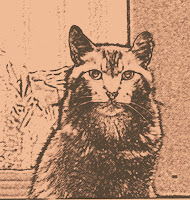
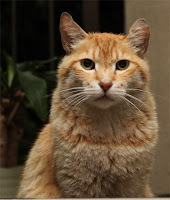
Genericizing a Face

Sometimes it is necessary to change the features in a face so the subject is not recognizable as a photographic likeness. Perhaps because you want to create a different effect or because the subject may not want to be recognized. 
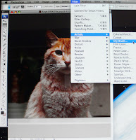
Solution: Render the photograph as a drawing or painting. Sketch or watercolor? There are artistic options in Photoshop.


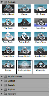
The subtler ones are cutout, dry brush, poster, watercolor.
Different focus, different accenture, the face can even be genericized.


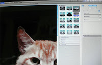
(1) Photoshop > Filter > Artistic > Cutout (choose from the menu that opens)
(2) Adjust using Brush Size, Brush Detail, Texture from the palette at the right.


Labels: , , ,

Wednesday, November 30, 2011

Blurring the background in Photoshop


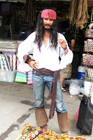
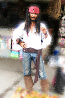
Jack Sparrow was selling some knickknacks. Jack is clear enough but the market background is cluttered and distracting.

If you want to accent a foreground and diminish surrounding clutter, Photoshop offers several possibilities beyond just blacking out the background.

(1) In Photoshop (CS3), select the background you want to obscure or distort using the magic wand.

(2) To bring Jack into the picture better…
Go Filter > Artistic
(3) Using the Artistic Palette try different effects from Color Pencil to Watercolor.
(4) Experiment particularly with the Brush Strokes and Sketch options.
(5) Each filter option has adjustments, for underpainting, for example, you can adjust the brush size. Also the scaling, and relief of texture, as well as the light angle. 
Filter > Artistic > Underpainting was used; it obscured effectively without drawing attention to the technique as other options do (eg Neon Glow or Plastic Wrap.
...

Labels: , , ,

Tuesday, November 15, 2011

Word callouts as speech balloons


Adding a speech balloon, a conversation bubble, Word lumps these under “call outs”, to a graphic needs a few steps if you don’t have any specialized tools for this.

A work around: 

(1) Paste the picture into a Word page.
(2) Go View > Object Palette > Callouts.
(3) Drag the Callout onto the Word page.
(4) Go Format > Object > Layout > Tight.
(5) Type into the callout, Comic Sans caps suitable.
(6) Snapshot using PrintScreen (Win) or Grab (Mac).
(7) Save as a jpg file.
...

Labels: , , ,

Monday, October 31, 2011

Photoshop Curves Tool


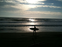
The photograph is shot against the sun. Too bright in some places, too dark in others. You can adjust it using the Brightness/Contrast controls in Photoshop.

But the Curves option is easier.

1. Open the Layers Palette. Click on the small black and white circle at the bottom.
2. Click on the Curves option.
3. A histogram will open. Position the mouse pointer on the curve and click and drag, experimenting until you find the right composition of light and dark.

You can also select parts of the picture to adjust using the magic wand tool. In the above photo I would keep the sky and the sea as they are and lighten from the shore down.

Even a rough iPhone image can be tweaked into visibility and even usability!


Labels: , , , ,

Tuesday, October 18, 2011

Photographing Books

Spine


In a sense, a photograph of a book is a piece of text.
Cover
There’s writing in it. The medium just happens to be jpg or whatever.

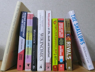
Photographing books. There are three approaches: (1) snap their spines, (2) mugshot the cover, (3) knock them flat.

Same as when cops arrest someone. (1) Bend them over the vehicle and put on handcuffs, (2) back at the station photograph them head-on looking stunned, and (3)  knock them around to get a confession.


Another analogy is a conference. (1) The chair introduces you to the audience with a sliver of who you are (name and title), (2) you, the speaker, gets up and faces everyone, appearing innocent or stoic or blithe, (3) in the Q&A you are beaten up and forced to fudge and maybe even dissemble. Despite your best efforts, much is revealed.

Laid out


Panasonic LX-2, f2.8, 1/25, 111018

Labels: ,

Sunday, October 16, 2011

Photographing Cars (1)


Mercedes 170d
Taking pictures of classic cars: Cars are not so difficult to photograph, unless they are jammed into a parking place or moving at speed. A wide-angle lens is helpful if you are shooting from close. Talk to the owner if you can to learn of what special features to focus on. Snap also the details: the emblem, or the hubcaps, or louvres. If the car lights can be turned on, this can sometimes add life.
Not always possible though, seize the moment (couldn't find the owner, used a digicam). However, the front of the car impresses as it emerges into the sunshine from a darkened garage,
Panasonic TZ5, f4.6, 1/125, 081222
...

Labels: ,

Wednesday, June 8, 2011

No Color, No Life

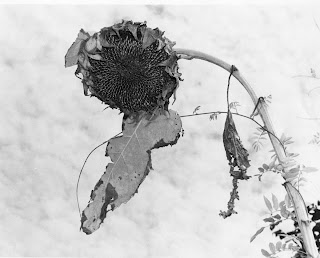
Sunflowers. There is an amazing energy in a field of yellow sunflowers.

Helen Keller said, 
”Keep your face to the sunshine and you cannot see the shadow. It's what sunflowers do.”

There comes a time nevertheless, when even a sunflower loses its life. And when life goes, color goes.

A black and white image of something as universally yellow as a sunflower, comes as a shock.

Is it because, as Stefan Kanfer says, “There's something strange and powerful about black-and-white imagery.”


Or is it the freshness effect, as Annette Funicello commented, “Watching television in those days was not the same experience as it is today. After years of listening to radio, we found the black-and-white images mesmerizing.


After all that color embedded in the multimedia coming at us every day, is a black and white image merely novelty? Or is the choice of black and white a manipulation of the media to magnify the statement?


Asahi Pentax, 200mm, 1974.

Labels: , ,

Tuesday, May 31, 2011

Two Cats. One Color.


“Dreaming of a white cat means good luck.” American superstition.

“Black cat or white cat: If it can catch mice, it's a good cat.” Chinese proverb.

Double the luck? Double the mice?

Matching the background to the subject doubles the impact.

And in this case, leaves the eyes, nose and ears.

Canon 5DII. HK. 17-40mm. ISO 2000. 1/25, f4.0.

...

Labels: ,

Friday, November 26, 2010

Decisive Moment (1)

...

Which picture?


Selecting a picture from a succession of images moving past the camera.


In the days of film, choosing the “decisive moment” (Cartier Bresson) used to be difficult, but now with speedy shutters, and digital storage, it is not.

Rowers on a river. The single scull approaches the landing.


In the first shot the single scull is too far away and the double scull is too close to the landing.


In the second shot, the single scull is just positioned right with a pleasing cluster of boats and landing.


In the third shot the scene has fallen apart. It is unbalanced and there is no connection between the single scull and the double scull.


On the computer screen we may have two or three or as many as a dozen shots to sift through.


See a short video on Cartier-Bresson here on the decisive moment.


Canon 5DII, 70-200 (200), f4, 1/3200, Colonia del Sacramento 101010


...

Labels: ,

Saturday, November 13, 2010

Receding into the Distance (2)

...

A variation on the theme of lamps receding into the distance.

Red foreground, red receding background.

Leonardo da Vinci's thoughts flicker in the lanterns.

"There are three aspects to perspective. The first has to do with how the size of objects seems to diminish according to distance: the second, the manner in which colors change the farther away they are from the eye; the third defines how objects ought to be finished less carefully the farther away they are."

Canon 5DII, 70-200mm (120), f4,1/3,200, Kyoto 100601
...

Labels: , ,